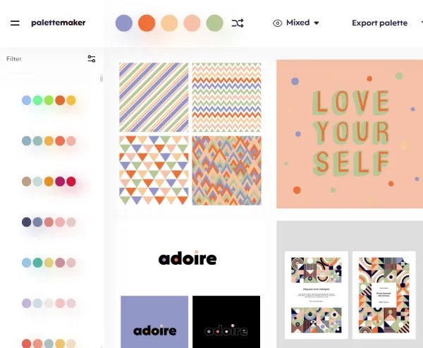
How to Create Stunning Color Palettes with PaletteMaker
Color is a powerful tool in design, capable of evoking emotions, establishing brand identity, and enhancing user experience. Whether you're working on a website, mobile app, or graphic design project, the right color palette can make all the difference. With PaletteMaker, you can easily generate and customize color palettes to suit your needs. This tool is ideal for designers, artists, and anyone looking to experiment with colors.

Why Use PaletteMaker?
PaletteMaker is an online application designed to help users create, customize, and export color palettes effortlessly. Here are some of the key reasons why it stands out:
- User-Friendly Interface: The app’s clean and intuitive interface allows users to focus on creativity rather than technicalities.
- Customizable Options: Adjust colors, add new shades, and fine-tune the palette to match your vision.
- Versatility: Suitable for a variety of design needs, including web design, branding, illustrations, and more.
- Export Features: Easily export your palette for use in other design software, ensuring seamless workflow integration.
How to Create a Color Palette
Creating a color palette with PaletteMaker is a straightforward process. Follow these steps to get started:
- Open PaletteMaker: Navigate to the PaletteMaker app on your web browser.
- Select Your Base Colors: Start by choosing one or more base colors that you want to build your palette around.
- Customize Your Palette: Use the adjustment tools to fine-tune each color, ensuring harmony and balance within the palette.
- Preview Your Palette: See how your colors work together in various contexts by using the app’s preview features.
- Save and Export: Once satisfied with your palette, save it for future use or export it for immediate application in your projects.
Best Practices for Choosing Colors
When creating a color palette, it's essential to consider color theory and the psychological impact of colors. Here are some tips:
- Contrast and Balance: Ensure there is a good balance between light and dark colors to maintain readability and visual appeal.
- Color Harmony: Use analogous, complementary, or triadic color schemes to create harmonious palettes.
- Cultural Relevance: Be aware of the cultural meanings of colors, especially if your project has a global audience.
Applications of Color Palettes
Color palettes created with PaletteMaker can be applied to various design fields:
- Web and Mobile UI: Improve user experience with visually appealing and accessible color schemes.
- Branding & Logo Design: Develop a consistent brand identity with carefully chosen colors.
- Illustrations and Art: Create depth and interest in your artwork through the strategic use of color.
- Typography and Posters: Enhance readability and attention with contrasting colors.
Final Thoughts
PaletteMaker is a versatile tool that empowers designers and creatives to experiment with colors and build beautiful palettes tailored to their specific needs. Whether you’re working on a large-scale project or just exploring color combinations for fun, PaletteMaker offers the flexibility and features to bring your ideas to life.


